YEAR
2025
YEAR
2025
ABOUT THE PROJECT
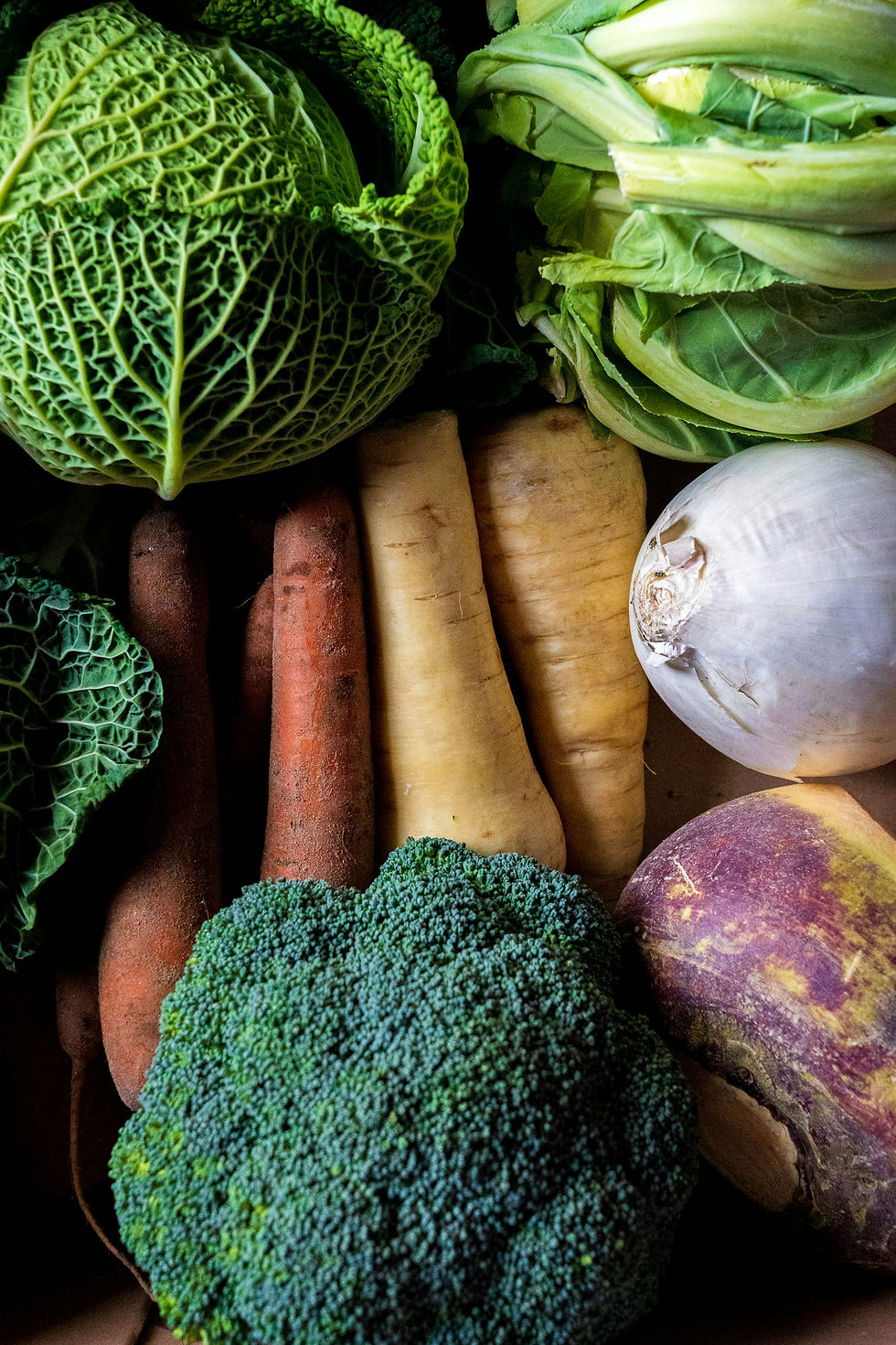
Theo is an authentic, family-owned Greek restaurant offering fresh, organic, and vegetarian cuisine.
A branding project rooted in seasonality, simplicity, and honest food.
CLIENT
THEO
YEAR
2025
SERVICES
Brand Identity, Graphic design, Illustration, Photography, Social & Content

(01) THE FOUNDATION
THE SEARCH
The challenge was to create a visual language that reflects tradition without feeling nostalgic or heavy. A balance between authenticity and freshness, simplicity and character.
THE IDEA
To create a visual language that can evolve with the rhythm of the kitchen.
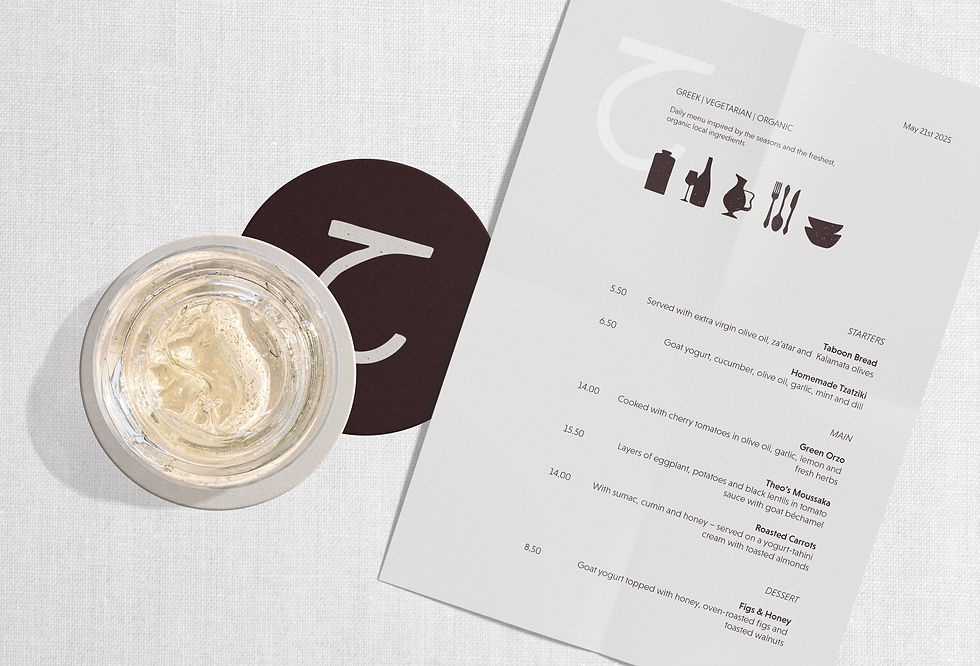
From opening posters to a distinctive logo, custom illustrations, and a menu that changes daily - extending naturally into social platforms.

(02) THE IDENTITY
VISUAL LANGUAGE
Organic shapes and hand-drawn elements create a soft, human visual language. The logo carries a gentle imperfection - adding warmth, character, and a sense of the handmade.
COLOR PALETTE
Earthy tones reflect a deep connection to nature and traditional Greek hospitality. Inspired by natural ingredients: sun warmed yellows, soft greens, muted blues, and warm neutrals. A balance between freshness and calm.


(03) THE STRATEGY
THE AUDIENCE
People who value conscious eating, simplicity, and quality.
An audience drawn to places that feel personal, calm, and genuine.
THE VALUES
Seasonality, honesty, and warmth.
A celebration of food that is made with intention and served with care.
(04) THE RESULT
OUTCOME
A soft, inviting identity that brings the spirit of the kitchen to life. Not only seen, but felt in the textures, the colors, and the quiet details.